
How to Choose Colors for Your Presentation (Without a Design Background)
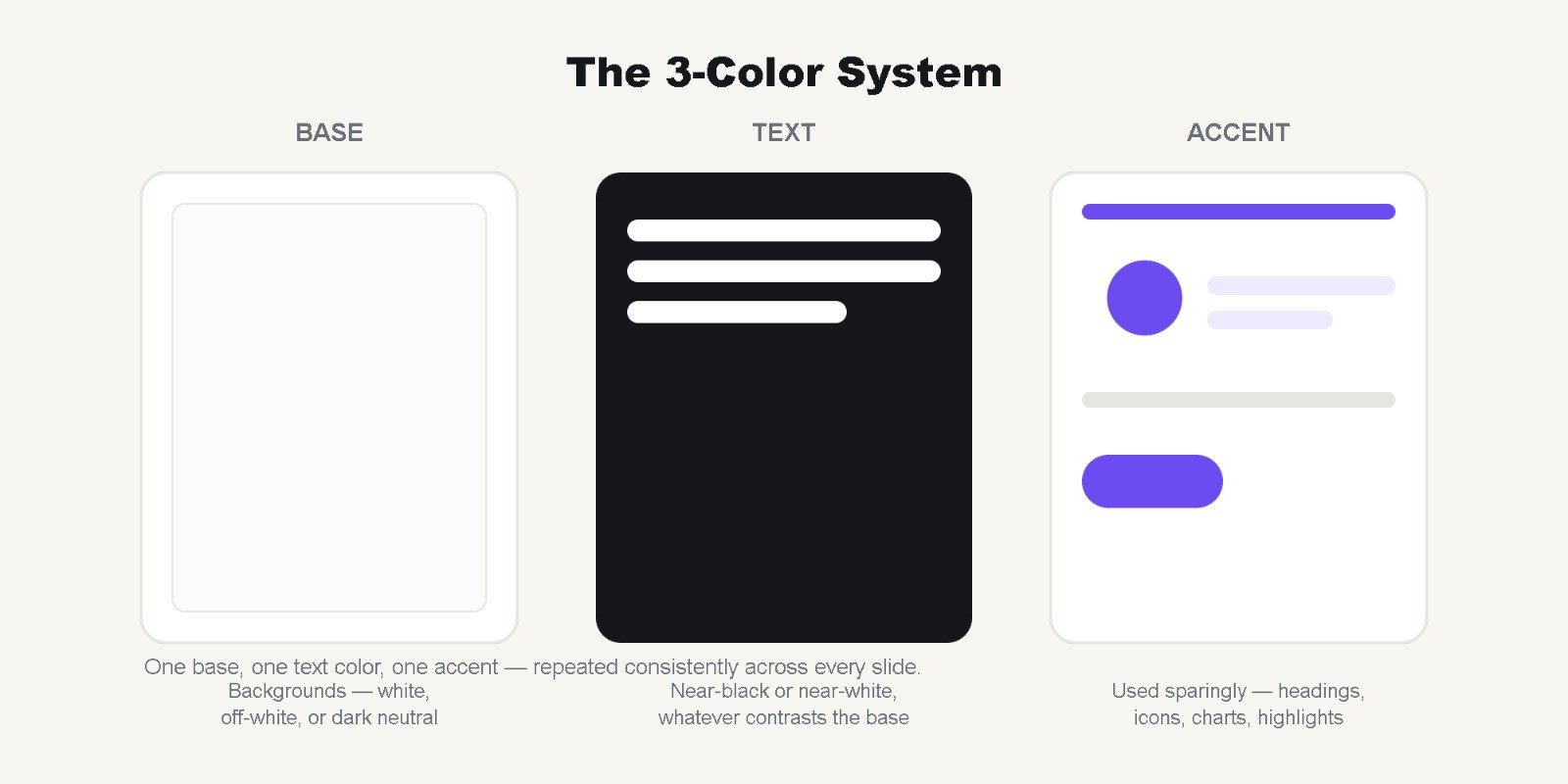
Color is one of the fastest ways to make a presentation feel either polished or amateur — and most people get it wrong not because they lack taste, but because they don’t have a system to follow. Here’s a simple one that works for almost any topic.
1. Start with three colors, not ten
A reliable palette has three roles:
- A base color — usually white, off-white, or a dark neutral, used for backgrounds
- A text color — near-black or near-white, whichever contrasts with your base
- One accent color — used sparingly for headings, icons, charts, and highlights
Resist the urge to use a different color for every slide or every section. The accent color’s power comes from repetition — it should feel intentional, not decorative.
2. Let your topic suggest the palette
Color carries meaning before anyone reads a word:
- Blue — trust, stability, corporate and financial topics
- Green — growth, sustainability, health, and environmental topics
- Deep red or maroon — urgency, passion, bold statements
- Purple — creativity, premium/luxury positioning
- Warm orange or amber — energy, approachability, education
If you’re unsure, blue is the safest default for business and academic contexts — it’s rarely the wrong choice.
3. Check contrast before you check style
A palette can look beautiful and still be unreadable. Light gray text on a white background might photograph nicely for a mockup, but it’s genuinely hard to read on a projector or a shared screen. As a simple rule: if you have to squint to read your own slide on a laptop screen, it will be worse on a projector.
4. Use tints and shades of your accent, not random new colors
Need a lighter or darker version of a section for variety? Don’t introduce a brand-new hue — use a lighter tint or darker shade of your existing accent color. This keeps the palette feeling unified even as it flexes across different slide types (data slides, quote slides, section dividers).
5. Steal palettes, don’t invent them from scratch
Some of the best-looking decks use color palettes borrowed from existing brands, national flags, nature photography, or design tools like Coolors.co. There’s no shame in adapting an existing palette — the skill isn’t in inventing colors, it’s in applying them consistently.
6. Test it in black and white first
If your slide’s information still makes sense with the color removed — if headings are still clearly bigger, and important numbers still stand out — it means your hierarchy is working independently of color. Color should enhance clarity, not substitute for it.
Want this done for you? Every template in our library comes with a tested, cohesive color palette already applied — so you can focus on your content instead of second-guessing hex codes. Or reach out if you’d like a custom palette built around your brand or topic.