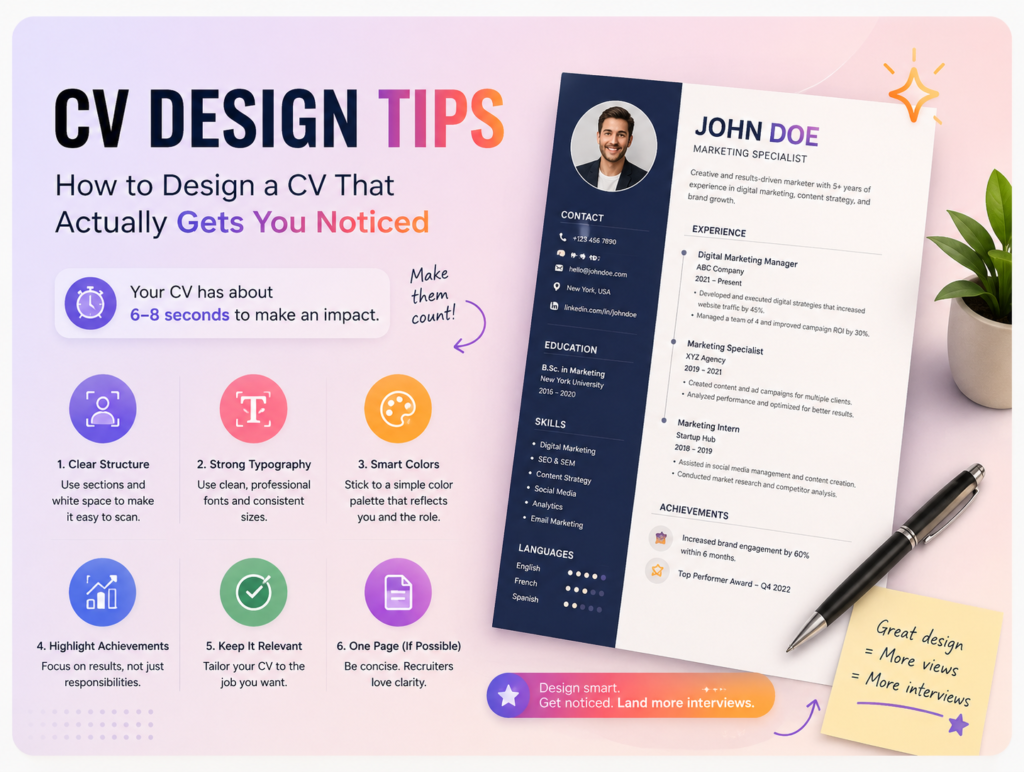
How to Design a CV That Actually Gets You Noticed
Your CV has about 6-8 seconds to make a first impression before a recruiter decides whether to keep reading. That’s not a lot of time — which means design isn’t a “nice to have,” it’s part of how your experience gets communicated. Here’s how to make those seconds count.
1. Pick one clear structure and stick to it
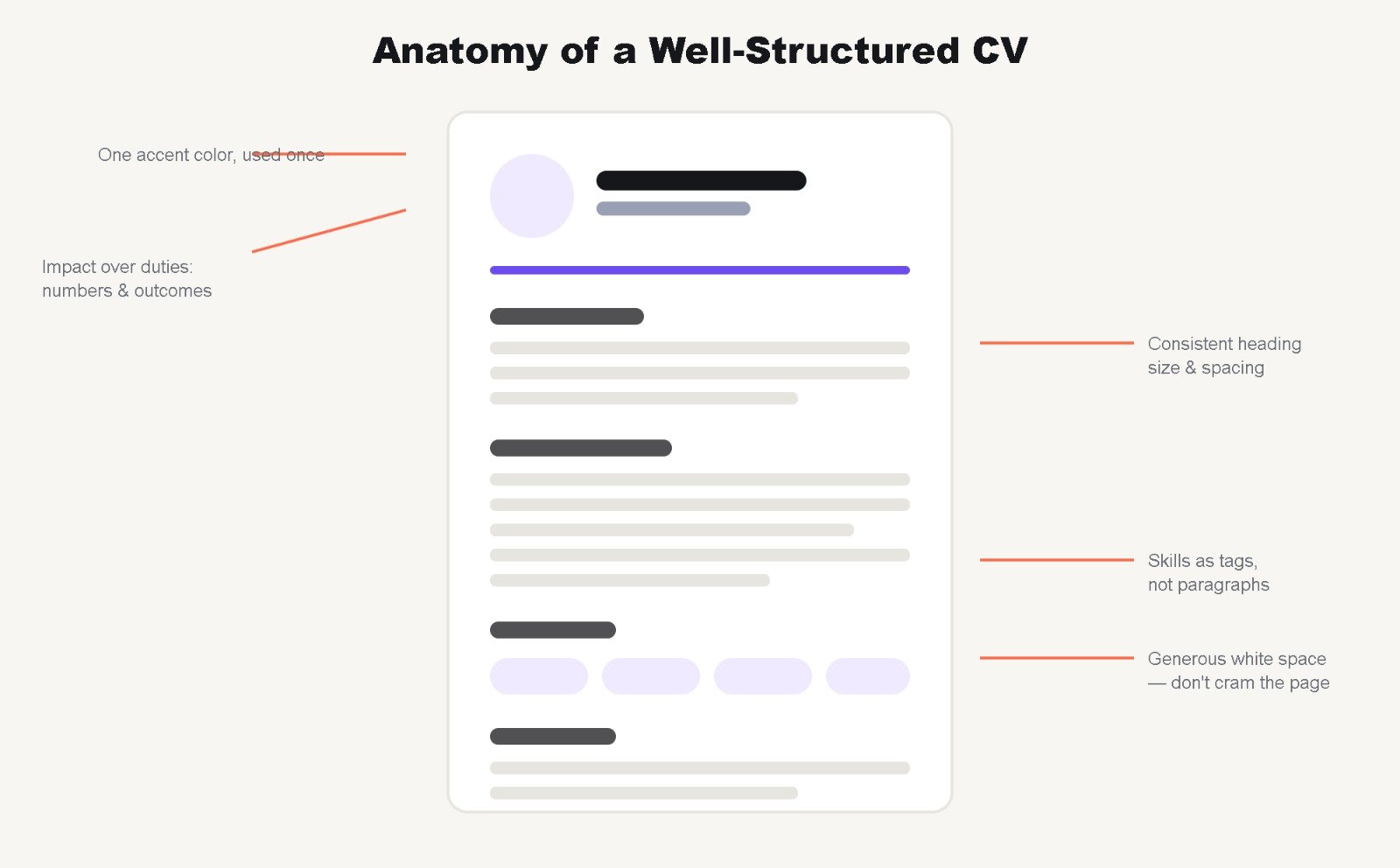
Recruiters scan, they don’t read line by line — at least not at first. A clear, repeated structure (Experience → Education → Skills, or whatever order fits your background) lets their eyes find what they’re looking for fast.
Tip: Use consistent spacing and heading styles between sections. If “Experience” is bold and 14pt, “Education” should be too — don’t let formatting drift as you go.
2. Use one accent color, not five
A single accent color — for section headers, a divider line, or your name at the top — adds personality without looking unprofessional. Stick to neutral tones (black, dark gray, white) for the body text, and let the accent color do the work of guiding the eye.
3. Don’t cram everything onto one page out of fear
If you’re early career, one page is usually enough — and that’s fine. If you have 8+ years of relevant experience, two pages is acceptable. What’s not acceptable is shrinking your font to 9pt or removing all white space just to force everything onto one page — that makes a CV harder to read, not more impressive.
4. Lead with impact, not duties
“Managed social media accounts” tells a recruiter what you did. “Grew Instagram engagement by 40% over 6 months” tells them what you’re capable of. Wherever you can, rewrite responsibilities as outcomes — even small, specific numbers make a line more convincing than a vague description.
5. Match the design to the industry
A creative role (design, marketing, media) can support more visual personality — icons, color blocks, a more unique layout. A corporate or academic role (finance, law, engineering) usually reads better with a clean, conservative layout that prioritizes clarity over flair. Design choices should support how you’ll be perceived in that specific field.
6. Export as PDF, always
Sending a CV as a .docx or .pptx risks fonts shifting or formatting breaking on someone else’s computer. Exporting to PDF locks in exactly what you designed, on any device.
Skip the guesswork: if building this structure from scratch feels like a lot on top of writing the actual content, start from a template that already has the spacing, hierarchy, and color balance figured out. Browse our CV templates, or message us if you’d like yours custom-built around your specific field.