5 PowerPoint Mistakes Students Make (And How to Fix Them)
If you’ve ever sat through a university defense or class presentation and felt your slides were working against you instead of for you, you’re not alone. Most PowerPoint problems aren’t about talent — they’re about a handful of habits that are easy to fix once you know what to look for.
Here are the five mistakes I see most often when reviewing student presentations, and simple ways to correct each one.
1. Cramming too much text on one slide
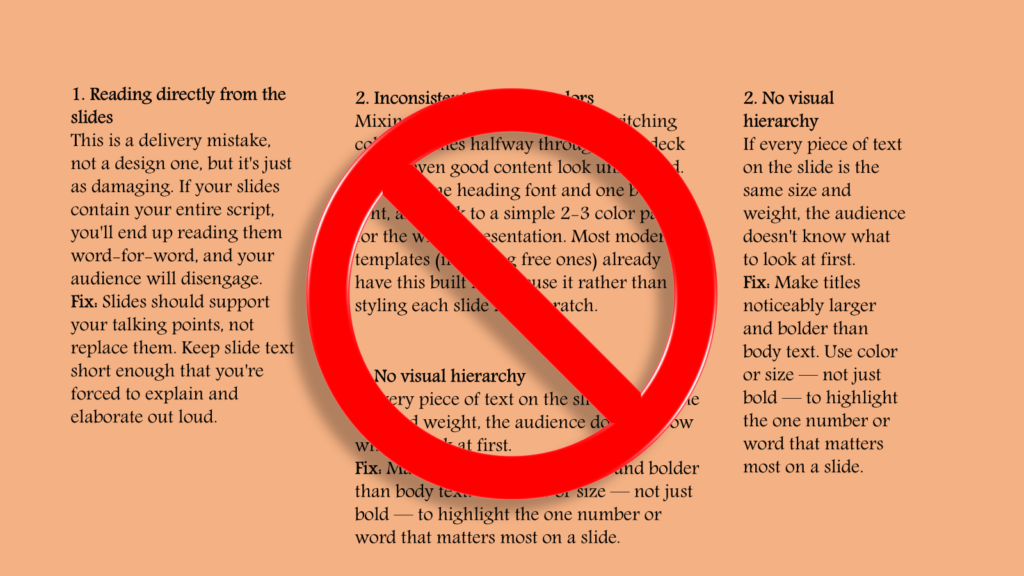
The biggest culprit. Students often treat slides like a written report, packing in full sentences and paragraphs. The problem is that an audience can either read your slide or listen to you talk — not both at once.
Fix: Limit each slide to one main idea, with no more than 5-6 short bullet points. If you have more to say, say it out loud and let the slide just anchor the idea visually.
2. Inconsistent fonts and colors
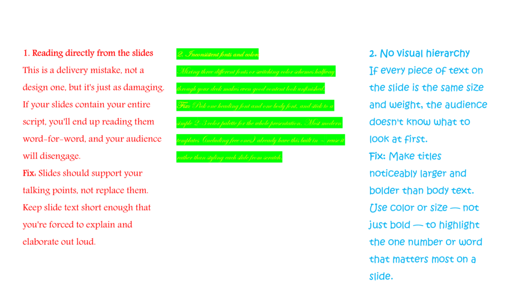
Mixing three different fonts or switching color schemes halfway through your deck makes even good content look unfinished.
Fix: Pick one heading font and one body font, and stick to a simple 2-3 color palette for the whole presentation. Most modern templates (including free ones) already have this built in — reuse it rather than styling each slide from scratch.
3. Low-quality or stretched images
Blurry logos, pixelated photos, or images stretched out of proportion are one of the fastest ways to make a presentation look unprofessional, even if the content is strong.
Fix: Use high-resolution images (search “transparent PNG” for logos) and hold Shift while resizing to keep the aspect ratio locked.
4. No visual hierarchy
If every piece of text on the slide is the same size and weight, the audience doesn’t know what to look at first.
Fix: Make titles noticeably larger and bolder than body text. Use color or size — not just bold — to highlight the one number or word that matters most on a slide.
5. Reading directly from the slides
This is a delivery mistake, not a design one, but it’s just as damaging. If your slides contain your entire script, you’ll end up reading them word-for-word, and your audience will disengage.
Fix: Slides should support your talking points, not replace them. Keep slide text short enough that you’re forced to explain and elaborate out loud.
The easy shortcut: a lot of these issues disappear automatically when you start from a well-structured template instead of a blank slide. If you’d rather skip the trial and error, browse our ready-made PowerPoint templates — each one is already built with consistent fonts, colors, and layouts, so you can focus on your content instead of your design.